Provide a greatly improved product that better handles the needs of medical training staff.
After our team went on location and interviewed staff members it was evident that they were heavily reliant on spreadsheet printouts and emails that quickly became out of sync to manage rooms, resources, instructors and attendees.
My Role
Lead Product Designer
Team
Sr. Product Owner
Sr. Business Analyst
Sr. System Architect
Front-end Developer
Discovery
UX Audit
Review existing user workflow for adding resources for live events. Determine needs for setting up buildings, rooms, and resources. Identify both required fields and necessary permission/status to be maintained throughout scheduling process.
UX Strategy
High-level sketches were created that stepped through initial resource setup/creation workflows.
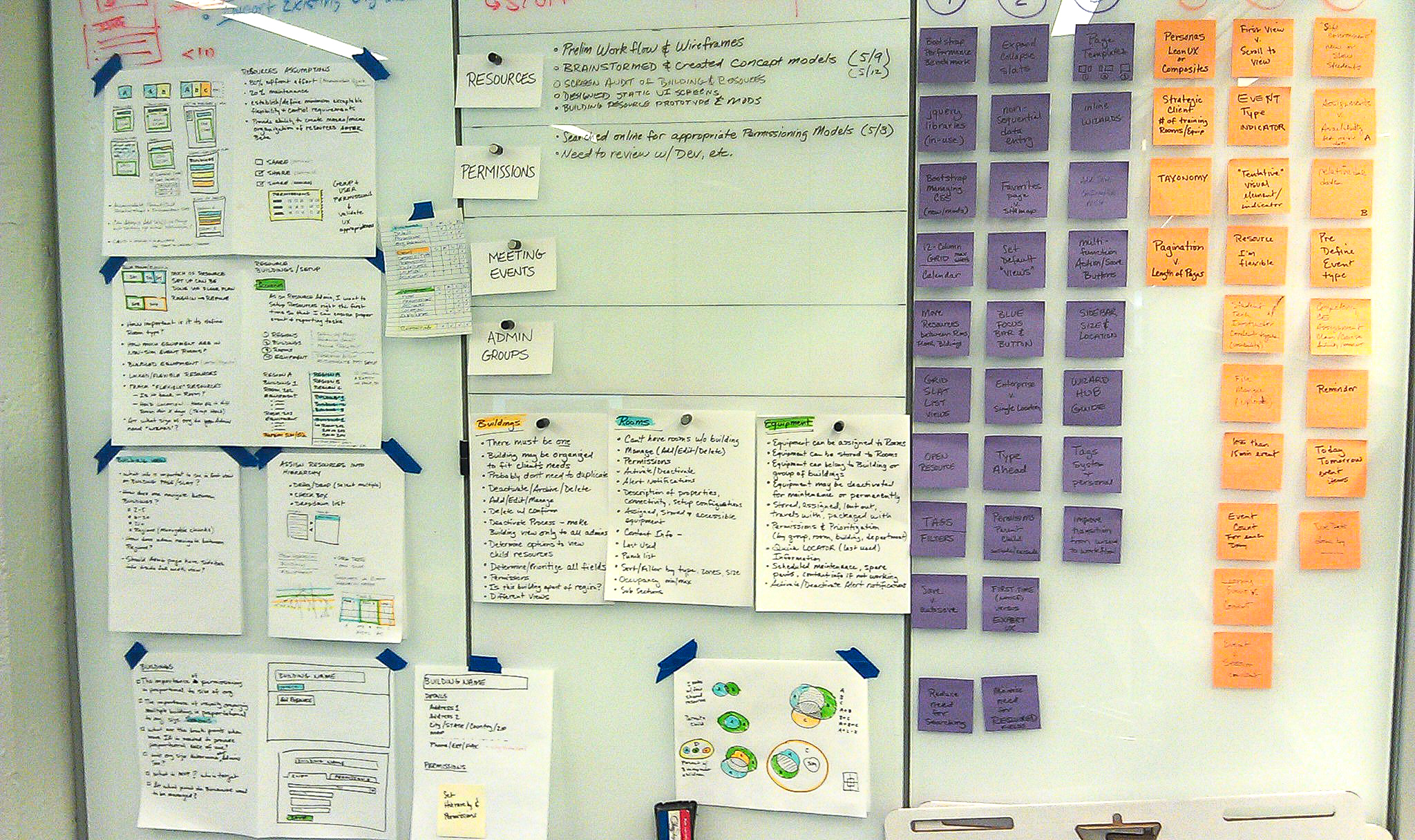
Brainstorm sessions helped us understand the business rules, technology constraints and priorities. We explored the resource and parent/child relationships within organizations and thought through ways to allow flexibility while removing user pain points in managing and scheduling resources.
Wireframes
A series of wireframes were created to think through the challenges in setting up rooms and resources across different halls, floors, and different locations.


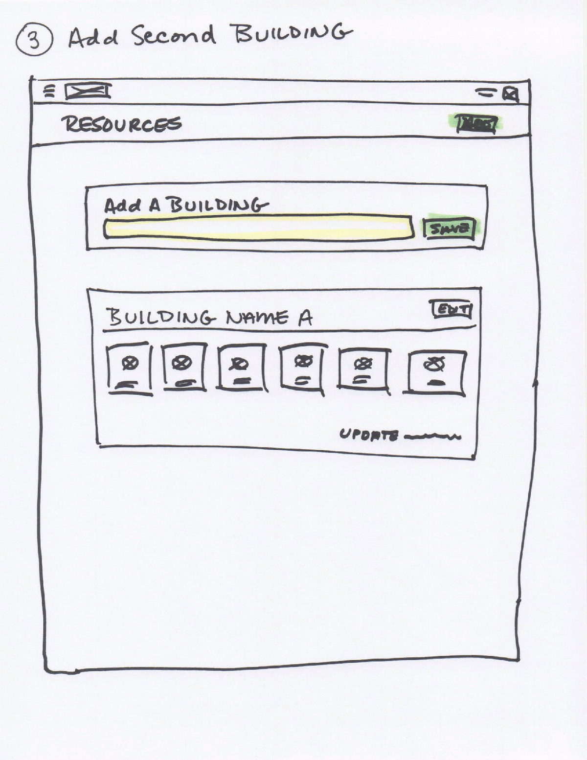
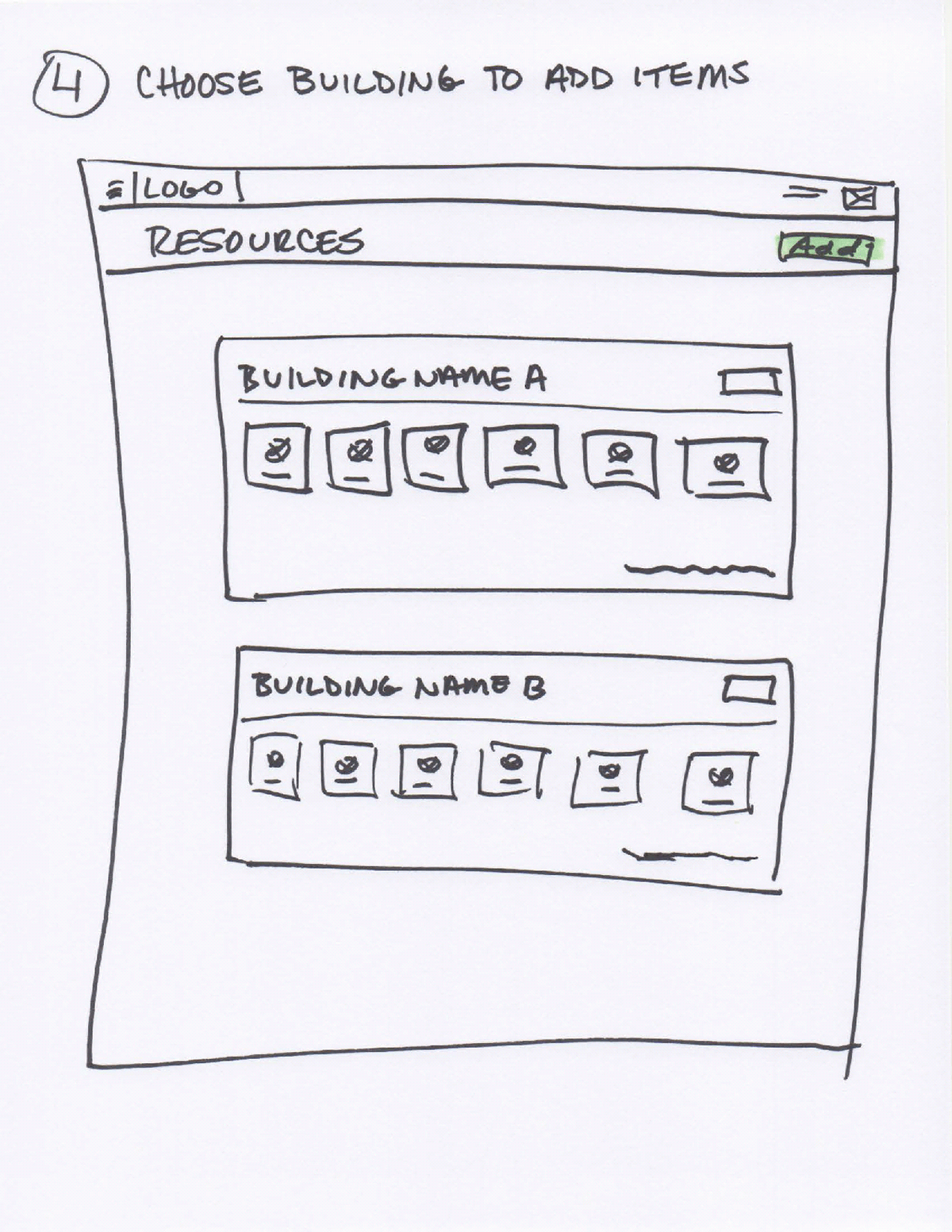


Capturing the Details
Understanding Complexity and Architectural Impact
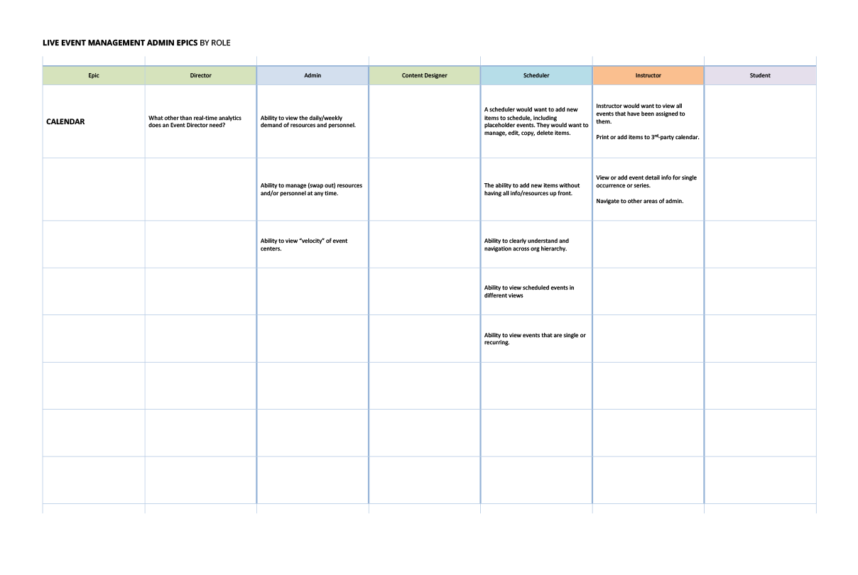
These matrices were designed to help the team identify user roles, organization types and how different sizes might impact the application. Other considerations were optimizing for desktop, tablet and mobile devices.

Medium-Fidelity Screens
Leverage Best Practices
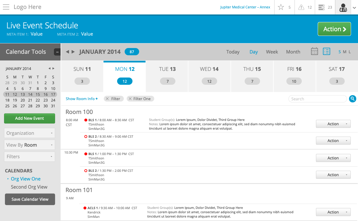
A goal was to leverage best practices of leading calendaring applications but to build a system to create, manage and report on utilization of personnel, rooms, resources, supplies, etc.
Working with Complexity
These screens were designed to determine threshold of how much “stuff” could users handle on a given screen and providing different ways to view their “stuff”.


Reflections
The initial kickoff of the project was promising and learning first-hand the problems facing users was compelling and an interesting challenge to solve. I landed a position at another company midway through the project. Years later I learned that the product was phased out.