Explore ways to elevate the experience on the Sherpa CRM Base Camp dashboard
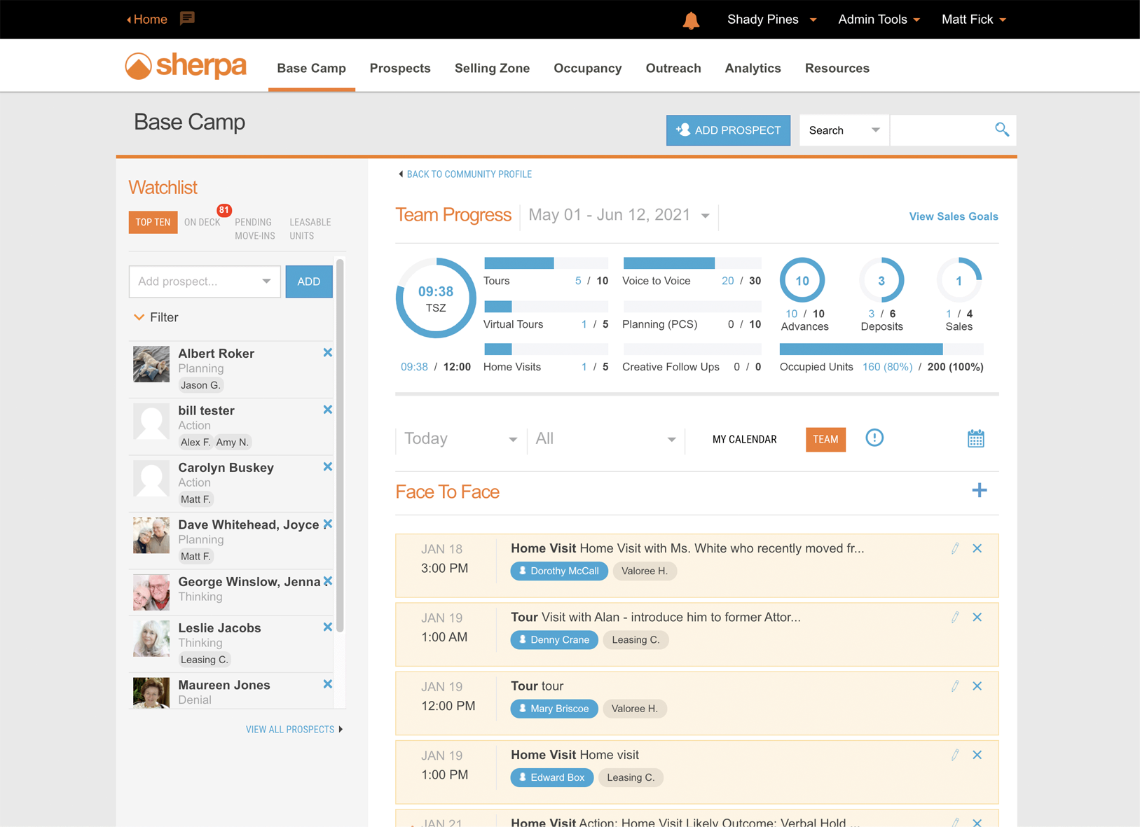
Updating this design was one of the first road map items that would leverage the underlying code base that was being explored during the design-thinking journey for the new Sales Team application.
Ideas from Users, Support, Success, Sales, Product, Development, and C-Suite were considered to make for a better experience that’s be more flexible and scalable for larger client community portfolios.
My Role
Lead Product Designer
Team
Sr. Director of Product Manager
President
Chief Executive Officer
Chief Customer Experience Officer
UX Audit

Opportunities
Strengthen visual hierarchy on the screen
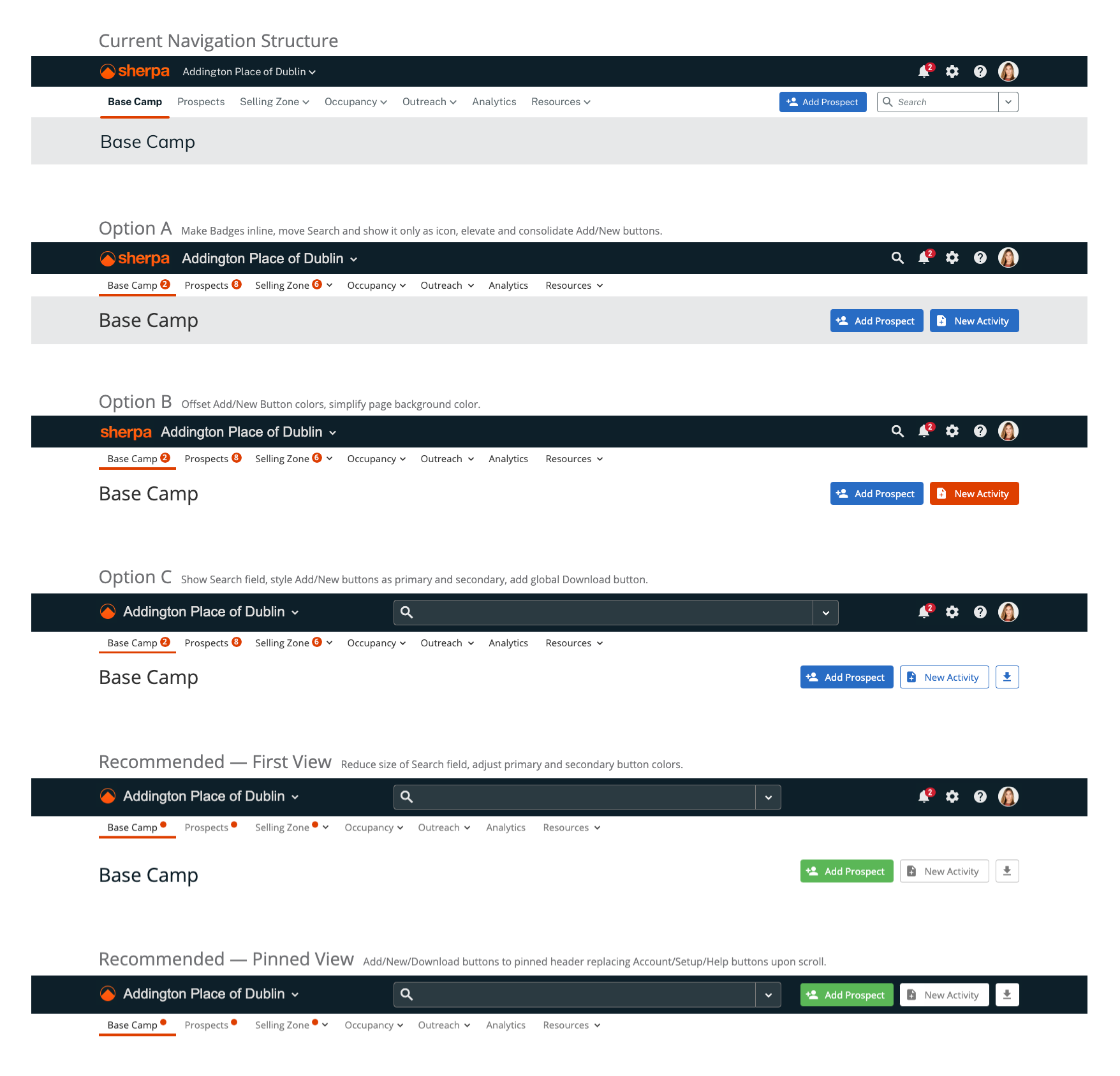
Simplify navigation and global utilities
Provide relevant info and actions on Top Ten list
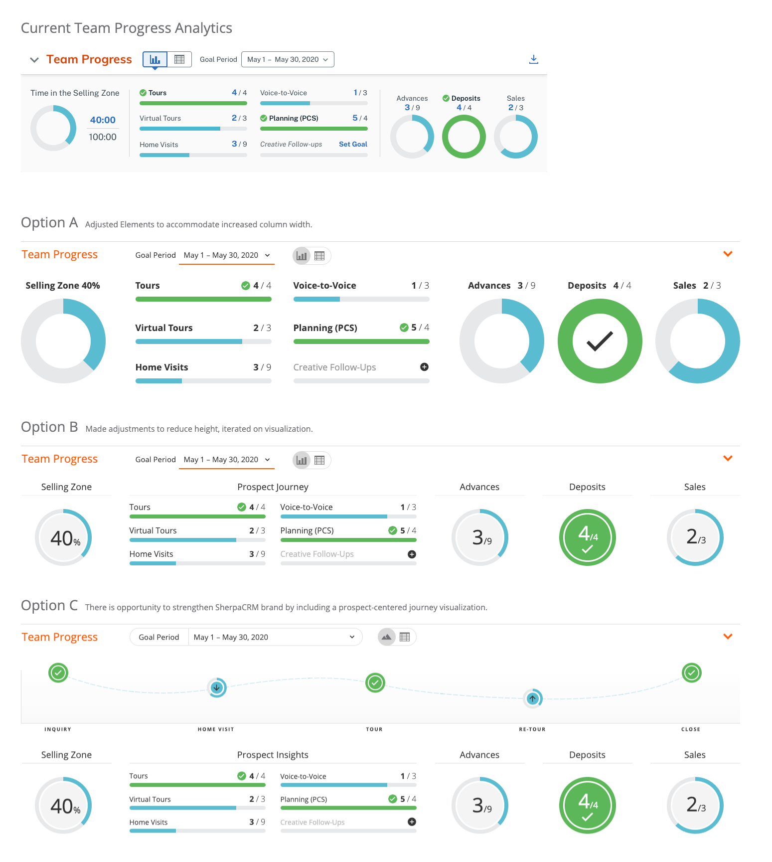
Improve Team Progress data visualization
Introduce batch functionality on activities
Increase eye scannability of activity section items
UI Redesign Overview

Navigation Bar
Unify overall design
Simplify navigation and global utilities
Simplify account menu and enhance permissions and roles for scalability
Introduce badge dots on main menu to alert users of updated content
Dashboard
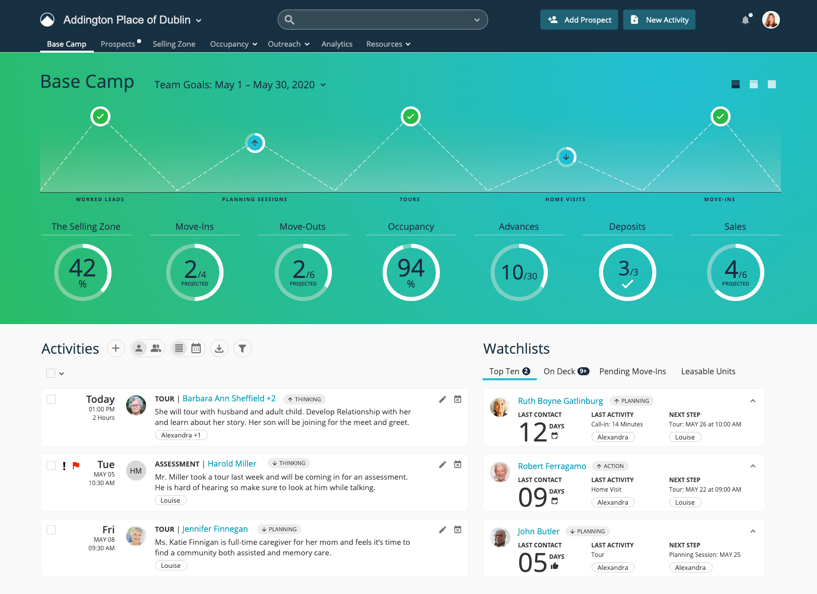
Increase sales teams insights for goals and occupancy health
Introduce three views allow increased work day focus on activities and watchlists
Strengthen branding Sherpa branding with “mountain” visualization
Introduce animation so that users can flip between percentage and X of Y on The Selling Zone and Occupancy
Activities Section
Introduce toggle pattern to switch between personal and team activities, and between list and calendar views
Enable users the ability to make bulk actions on several activities
Introduce arrow icons helping users know if prospect is moving toward or away from taking action
Replace generic person icon to prospect initials as default avatar
Top Ten Watchlist
Highlight how many days since last contact, last activity and what the next step is
Introduce icons to alert users that too much time has elapsed with any contact and new activity should be scheduled
Introduce functionality to expand items to show additional information to enable users to do more from Base Camp
Design Deconstructed


Reflections
Base Camp redesign was deprioritized in favor of simplifying the primary workflow within the CRM. Several months later it was announced that the company was merged with two other senior living CRM companies, and the executive team decided to move forward with one of the other CRM products.